Kateryna Orel
Inbound by Hubspot
2024

The Problem
The INBOUND conference analysis of the 2023 website highlighted areas for improvement, including information discoverability, event registration, and overall usability. Additionally, the site needed to effectively address three key phases: pre-event, event, and post-event, each with unique user expectations and requirements. The 2023 site structure featured a confusing UX with many orphaned or hard-to-find pages and modals nested within other modals, further complicating the user experience. The challenge was to create a new ADA complient experience for the new 2024 INBOUND site, that resolved these issues while reflecting the innovative nature of the conference.

Process
Discovery and Research: The project began with a thorough analysis of the 2023 website, focusing on quantitative data from analytics and qualitative insights from user feedback. Key discovery activities included:
User Analytics Review: Highlighted high-traffic areas, drop-off points, and engagement trends.
Client Discovery Sessions: Conducted collaborative workshops with the INBOUND team to align on goals, needs, and pain points.
Competitive Analysis: Benchmarked against industry-leading event websites to identify effective practices.
Defining Goals and Shared Understanding With Client: Based on the insights from the research phase, user personas were refined to represent the primary audience segments: first-time attendees, returning participants, and potential business partners. Each persona had distinct goals, such as seamless registration, clear agenda browsing, and quick content access.
Sitemap & Wireframing: The next step was translating research findings into actionable design ideas. Wireframes were created to illustrate streamlined user flows, ensuring intuitive navigation and prioritization of key content. Emphasis was placed on:
Simplified and visually engaging event information layout.
Clear, actionable CTAs for registration and session browsing.
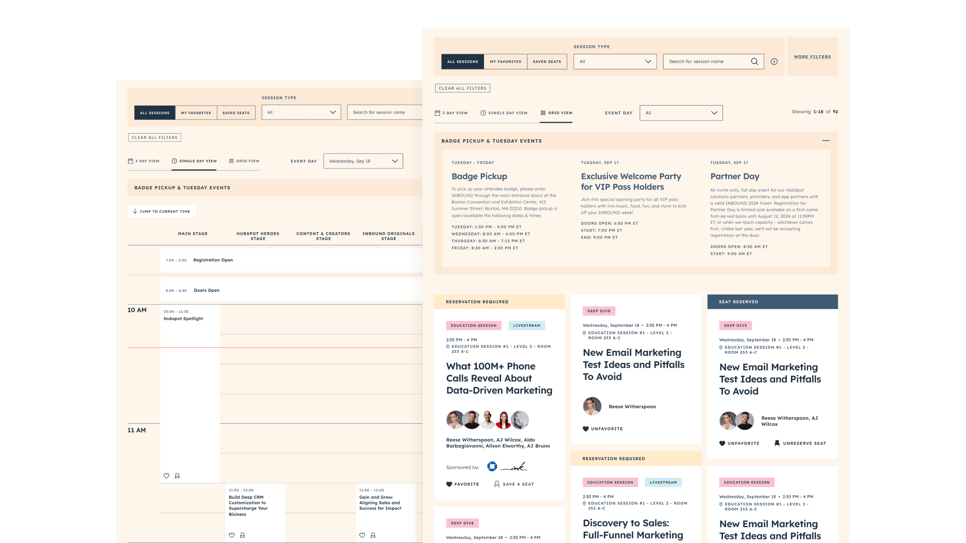
Improved search and filter functionality for the agenda.
Look and Feel Development: The visual design concept aimed to capture the energy and creativity of the INBOUND conference. This was achieved by:
Integrating bold typography and dynamic imagery.
Using a cohesive color palette that mirrored the event’s brand identity.
Crafting a layout that balanced modern aesthetics with functional design.
Solution
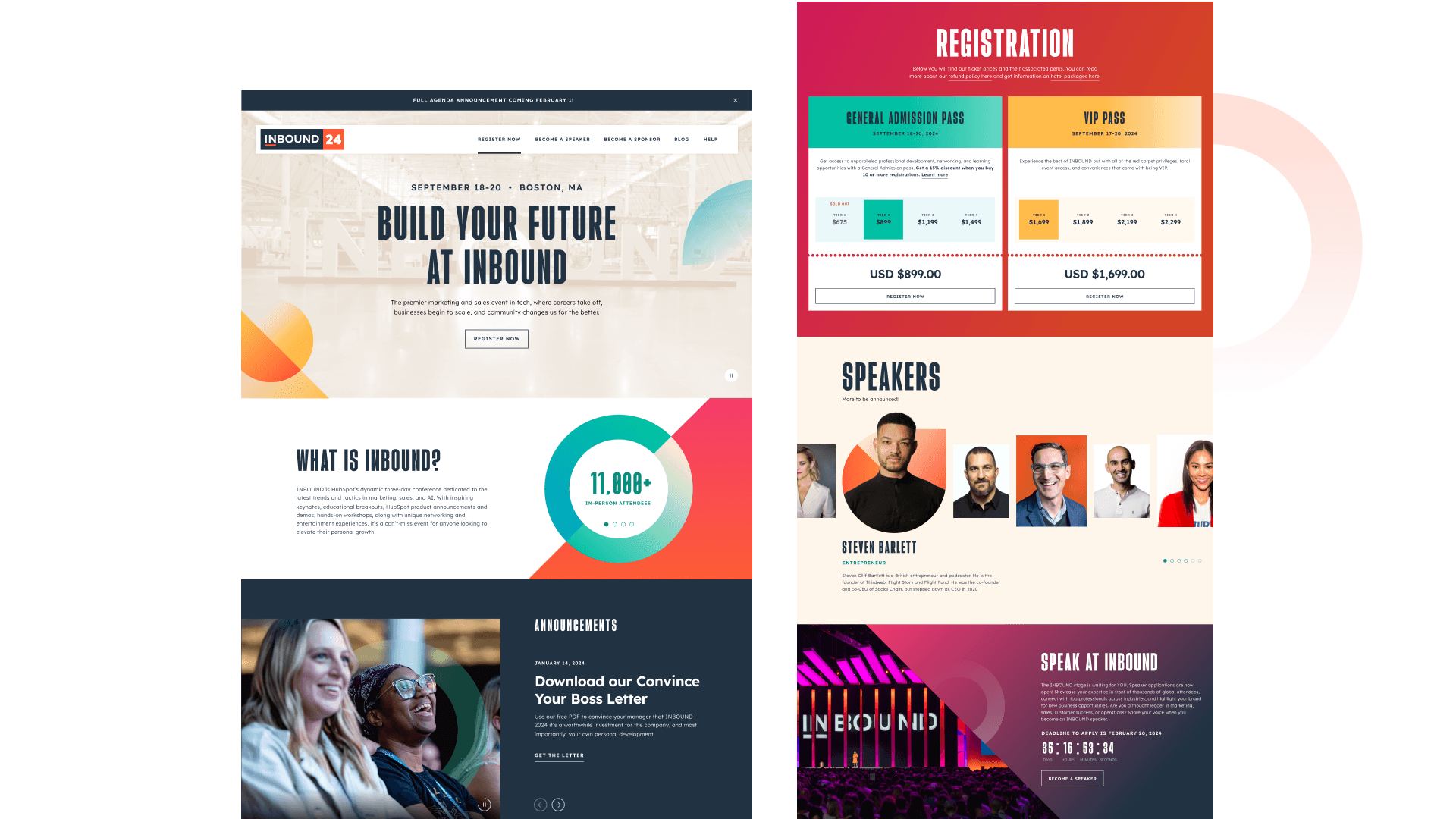
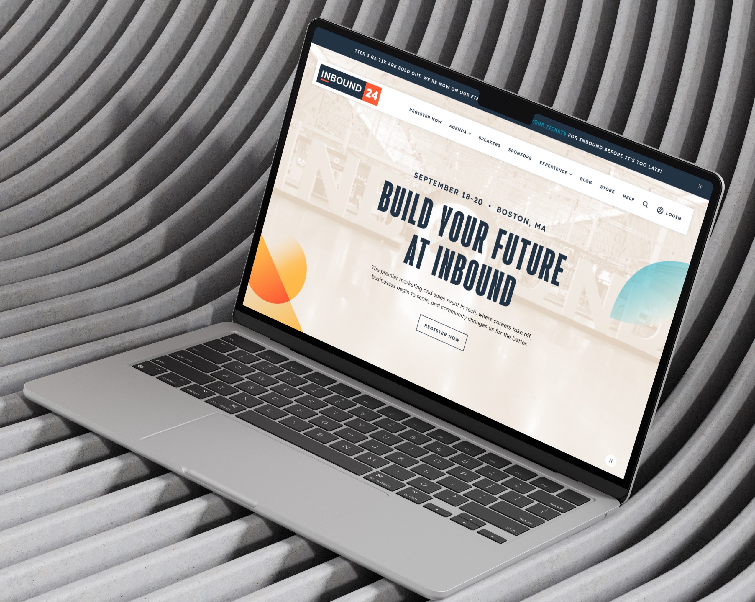
The final design for the INBOUND 2024 website incorporated:
Enhanced Navigation: A restructured menu and sticky navigation bar that adapted to user needs.
Dynamic Content Sections: Highlighted featured speakers and sessions with interactive elements.
Streamlined Registration Process: Simplified multi-step forms with clear progress indicators.
Responsive and Accessible Design: Ensured compatibility across devices and adherence to accessibility standards for an inclusive user experience.

Outcome
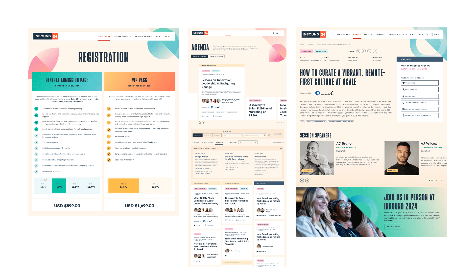
The new site design was significantly more dynamic, interactive, and animated compared to the previous year’s version. We observed higher user engagement and a notable decrease in the bounce rate by an average of 31% on the highest trafficked pages. This improvement indicated that users were finding content much quicker and exiting the site less frequently than before. Enhancing the user experience and design of the Agenda was a key focus. This included creating individual session pages that could be linked to directly, and new visualization options such as a 3-day overview and a single-day calendar view.
